Friday 31 July 2009

Chapter 11 a precis of bold design development

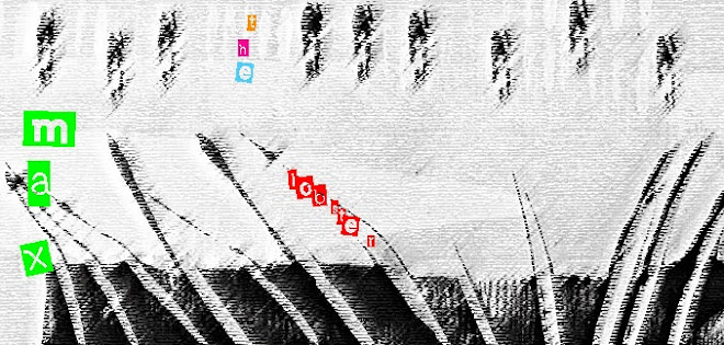
before i start on chapter 11, and my brief sojourn from sanding and plastering (hallway), i recently started looking at street 'graffiti' legitimately plastered over roads and pavements. i have no idea what it means but assume they are messages for workmen where to dig/move things/put things? etc. i must ask someone! it can be quite colourful and with great lettering and shapes as you can see from Max's shadow. i have also witnessed a gardener with his trusty spray can spraying dots on the earth in a flower bed to indicate where flowers should be planted! is this necessary?
this chapter asked for bold, simple marks relating to the shapes and colours of my theme, graffiti. there is nothing i like more than the simplicity of brush strokes and the edges/shapes you can achieve with them. i used a 4" wide paint brush and with the above, quite wet paint. i was hoping to get drips, brush ends and 'stripes'.
combining two colours with dry thick fabric paint on top of ink.
trying quite a dry brush with inks.
cutting up photocopies of the brush strokes and re-arranging them in strips and rectangles. the one on the left above makes me think of fringing and still on a tartan role, tartan fringing!
again above, similar re-arrangements, getting more fringing.
weaving in strips to create a pattern.
and finally using rectangles to create a collage with added lines extended.

Thursday 23 July 2009

More of Chapter 8 (very briefly)!

this is a very short post to keep things ticking over! i might not post now for a few days as the plan is to decorate our hallway whilst son is on cub camp! oh what exciting lives we lead!!!!
anyway more linear shapes, this time based on the 'halos' above.

using my coloured papers from earlier in chapter 8, i chose this design for its simple shapes. once again, sheets of paper were layered up and cut the same finally re-arranging like a jigsaw. it shows how accurate you need to be when cutting with a scalpel!

Monday 20 July 2009

Banksy vs Bristol, a pink cuddly spider and definately another photo opportunity!

i'm not very good early in the morning! but we'd decided to catch the 8.23 train to Bristol in order to allow plenty of queueing time! it took 1 hour 37 minutes, two trips over the road to various shops, a trip to Greggs for sausage rolls and a fair amount of whingeing from son, although he was very eager to see the animatronics.
at last the end is in sight!
apologies to those of a nervous disposition but 9 year old boys are drawn to anything they think slightly on the 'rude' side! this is for him.
only £2 from primark! this reminded me of a 15 year old work experience girl we had recently who bought a pair of sunglasses at the previously mentioned store.
do i need to say more!
we were not allowed to use flash inside the exhibition so i thought you might like to see some of my 'arty' photos or are they just out of focus! no comments please!


i've noticed recently how people tend to use their cameras too readily without actually absorbing the experience of what's in front of them. its almost as if they need the photo to back up the memory. what ever did we do without cameras?
anyway another Banksy (with blue paint) and another photo opportunity further down the road! all in all a great day was had by all, an excellent, clever and amusing exhibition. my son is now the proud owner of a pink and black 12" spider!!!! oh dear museum shops have a lot to answer for! and i am the proud possessor of 3 cans of spray paint(NOT SOLD IN THE MUSEUM SHOP)!

Friday 17 July 2009

Freaky Friday! Chapter 8, hollow outline.

at last i have a free un-child, un-work cluttered morning, probably the last for 7 whole weeks! Oh what to do with the little dear! Banksy tomorrow i hope. anyone else going please contact me?! anyway this chapter explores linear shapes. i went back to my sketchbook and the brush stroke, above right. i cut out a stencil and traced around several times and in various directions. there are more but i will just show a couple here!

by layering and overlapping a series of different lines were formed which were then used for the next process. the papers i used were coloured with chalk pastels. although Sian says 'a plain surface is so uninspiring' many spray painted surfaces are very smooth and evenly coated! i felt chalk pastels would lend themselves to the effect i wanted to achieve. some papers were coloured with two or more colours merging in the middle. some colours took at least 3 chalks to blend the correct colour.
i found my box of 50 'Grumbacher'chalks about 20 years ago in an Oxfam shop on Kensington High Street for 30p and i have never used them! until now!!! i am quite smitten with them but they are VERY messy. especially as i used my fingers to merge the colours. other contrasting colours were rubbed into stencil shapes for added embellishment. i used Sian's 'stack and whack' method of cutting out, dividing the papers across their width and then re-arranging them in various ways.above 2 pieces linking arms! and what look like legs walking.
layers fanned out and machine stitched to background colour and using a semi transparent japanese paper for layering.
slotting pieces together above.
again slotting 3 pieces together. something in there reminds me of rabbit monsters and 'tartan' which i will delve into at greater depth later!

Tuesday 14 July 2009

'P Squidy' hits the shops!

Lego have joined the graffiti race! Squidman, aka P Squidy is armed, dangerous and slime coated and ready for intergalactic graffiti. Unfortunately he doesn't come with his spraycan! a great hit with my 9 year old but the video on the Lego website is also quite fun! more textile related stuff tomorrow i promise.

Sunday 5 July 2009

'One extra'

it seems a long time since my last blog, i have not been idle and i feel a big responsibility to keep up with regular postings! i have been thinking of my resolved proposal for chapter 12 but in the meantime Sian has suggested another stitched sample to add to chapter 7. her suggestion was to work a phrase/letters that could then be cut up so glimpses of words/letters could be seen. the sample has been worked with various layers of fabric and newsprint that have then been stencilled with fabric paints. i chose the quote
'when we first see them we cannot understand them. we stand outside the cultural structures in which that understanding is embedded.'

taken from 'handwritten, expressive lettering in the digital age' by steven heller and mirko ilic.
conventional school alphabet stencils were used for this with graphite and letraset. over the top 'halos' were stitched through tissue in running stitch, back stitch and chain stitch. the tissue then pulled off, leaving some behind. echoes of the halos were stencilled over the top.

i chose to cut the piece into letters, forming the word 'lace'. above and below shows the letters still in their uncut position.

re-arranging the letters to 'read' and below layering them randomly.